Model visualisation
This page lists my published software for model visualisation. This work forms the basis for the third chapter of my thesis.
classifly: Explore classification boundaries in high dimensions.
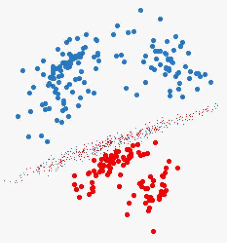
Given p-dimensional training data containing d groups (the design space), a classification algorithm (classifier) predicts which group new data belongs to. Generally the input to these algorithms is high dimensional, and the boundaries between groups will be high dimensional and perhaps curvilinear or multi-facted. This R package provides methods for visualising the division of space between the groups.
clusterfly: Explore clustering results in high dimensions.
Typically, there is somewhat of a divide between statistics and visualisation software. Statistics software, particularly R, provides implementation of cutting edge research methods, but limited graphics. Visualisation software will provide sophisticated visual interfaces, but few statistical algorithms. The clusterfly package presents some early experimentation aimed at overcoming this deficiency by linking R and GGobi. Cluster analysis was chosen as it is an exploratory method that needs sophisticated visualisation and statistical algorithms.
There are also some custom methods for certain types of clustering, mostly inspired by the work of Dr Dianne Cook:
- Self organising maps (aka Kohonen neural networks),
?ggobi.som. Displays the self organising map/net in the original space of the data - Hierarchical clustering,
?hierfly. Connects data points with lines in like a dendrogram, but in the high-dimensional space of the original data - Model based clustering,
?mefly. Adds ellsipoids from the multivariate normal distributions the clusters are based on
meifly: Models explored interactively.
Meifly is tool that uses R and GGobi to explore ensembles of linear models, where we look at all possible main effects models for a given dataset (or a large subset of these models). This gives greater insight than looking at any small set of best models alone: an ensemble of many models can tell us more about the underlying data than any individual model alone.
Installation
Please make sure you have a current version of R and rggobi installed, then use the following R code:
install.packages("classifly")install.packages("clusterfy")install.packages("meifly")
Presentations/publications
- CMV Poster on clusterfy. London, July 2006
- Clusterfly paper submitted to CMV. Outlines motivation and describes some results
- Exploring classification boundaries in high dimensions (PDF 300k), presented at Interface 2006 by Doina Caragea
- Meifly (PDF, 180k), presented at JSM 2007. This paper won a student paper award from the ASA Sections on Statistical Computing and Graphics.